Data Visualization
TL;DR: We developed an interactive visualization tool built with React, D3.js, and Pandas to analyze and explore global opinions on climate change using a dataset of 14 million anonymized tweets from 2006-2018. The platform enables users to identify regional sentiment patterns, track changes over time, and detect biases through dynamic charts, interactive world maps, and temporal filters. By leveraging NLP techniques for sentiment and stance analysis, the tool offers a nuanced understanding of climate change discourse worldwide.
Introduction
Climate change presents a pressing global challenge with far-reaching consequences, impacting countries disproportionately. Immediate action is crucial to prevent catastrophic outcomes, as outlined in the 13th UN Sustainable Development Goal. However, understanding global opinions on climate change remains essential for effective mitigation strategies.
Problem
Current methods predominantly rely on general surveys with limited nuance. Qualitative analysis of textual content, particularly from social media, offers a more nuanced understanding but is underexplored. Thus, there's a need to explore and comprehend factors influencing opinions on climate change worldwide.
Solution
We present a comprehensive visualization tool leveraging natural language data from social media to address this gap. Our platform allows users to explore and understand their country's stance on climate change, detect biases, and identify trends over time.
Research
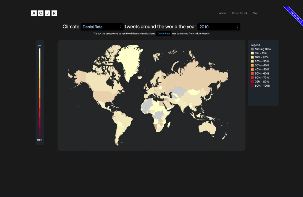
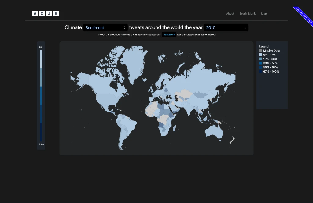
We utilized a climate change Twitter dataset spanning 2006-2018, comprising 14 million anonymized tweets. Key attributes such as geolocation, sentiment, aggressiveness, and stance were analyzed using NLP techniques. Preprocessing involved subsampling geolocated tweets and mapping coordinates to countries.
Design
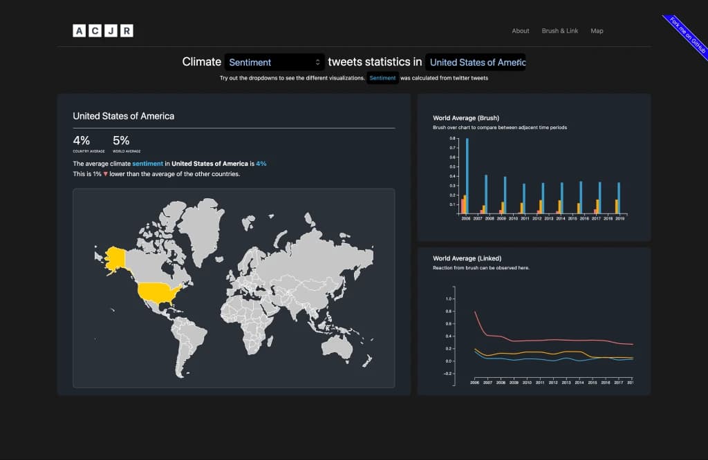
Our visualization tool caters to three main tasks: identifying regional patterns, analyzing global sentiment distribution, and tracking changes over time. Iterative design processes led to the development of interactive world maps with dropdown selectors and time sliders for enhanced exploration.
Final Product
The platform features two main views: one focusing on individual country data with dynamic charts, and another providing a holistic perspective with global averages. Users can filter attributes and explore temporal trends effortlessly.
Reflection/Lessons Learned
The visualization effectively enables key data analysis tasks and facilitates user interaction. While acknowledging imperfections in automated measures, we encourage deep exploration while exercising caution in drawing conclusions.
Acknowledgements
Our tool leverages React, D3, and Python (pandas). We draw inspiration from seminal works in visualization, ensuring usability and effectiveness.
Cleveland, W. S., & McGill, R. (1984). Graphical perception: Theory, experimentation, and application to the development of graphical methods. Journal of the American Statistical Association, 79(387), 531-554.
Effrosynidis, D., Karasakalidis, A. I., Sylaios, G., & Arampatzis, A. (2022). The climate change Twitter dataset. Expert Systems with Applications, 204, 117541.
Leiserowitz, A., et al. (2020). Climate Change in the American Mind: April 2020. Yale University and George Mason University. New Haven, CT: Yale Program on Climate Change Communication.
Schneiderman, B. (1996). The eyes have it: A task by data type taxonomy for information visualizations. In Proceedings 1996 IEEE symposium on visual languages (pp. 336-343). IEEE.
Wall, E., et al. (2018). A heuristic approach to value-driven evaluation of visualizations. IEEE Transactions on Visualization and Computer Graphics, 25(1), 491-500.